Design Process
TECHSPECIALIST CONSILTING LIMITED
ROLE
Ux/Ui Design
Web Design
CLIENT
Techspecialist Consulting Limited
PLATFORMS
Web
Tablet
YEAR
2016
Case Study
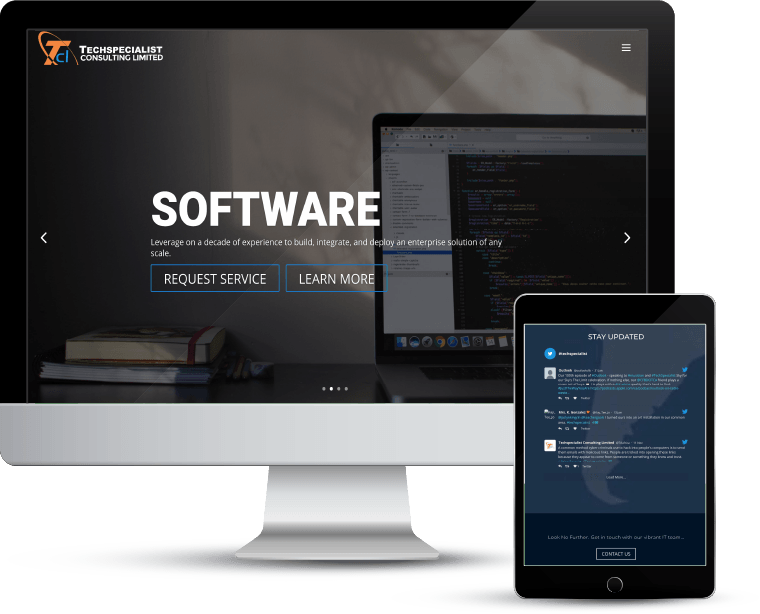
Techspecialist was founded in 2008, Techspecialist Consulting Limited operates information and communication technology (ICT) systems for multinational corporations, public and private sector institutions. With a wide range of products and services, the company required a revamp of their website so it can better explain the various areas the company covers.
Problem
The organization whose headquarters is located in Nigeria has a Uk branch and needed a way to link up the UK branch with that of Nigeria’s. The client also needed to have easy communication with clients, thus needed the means to respond quickly to users inquiries.
Goal
1. Complete revamping of the client’s website while considering all the products and services they offer.
2. Implement a faster approach to communicate with users.
Research
Understanding the process
Research involves understanding the structure of the previous website. I drew up a site-map that aided the recent design of the website. Through research, we understood the difficulty of users in sending mails to the company as the contact section is not user friendly.
Proposed Implementation
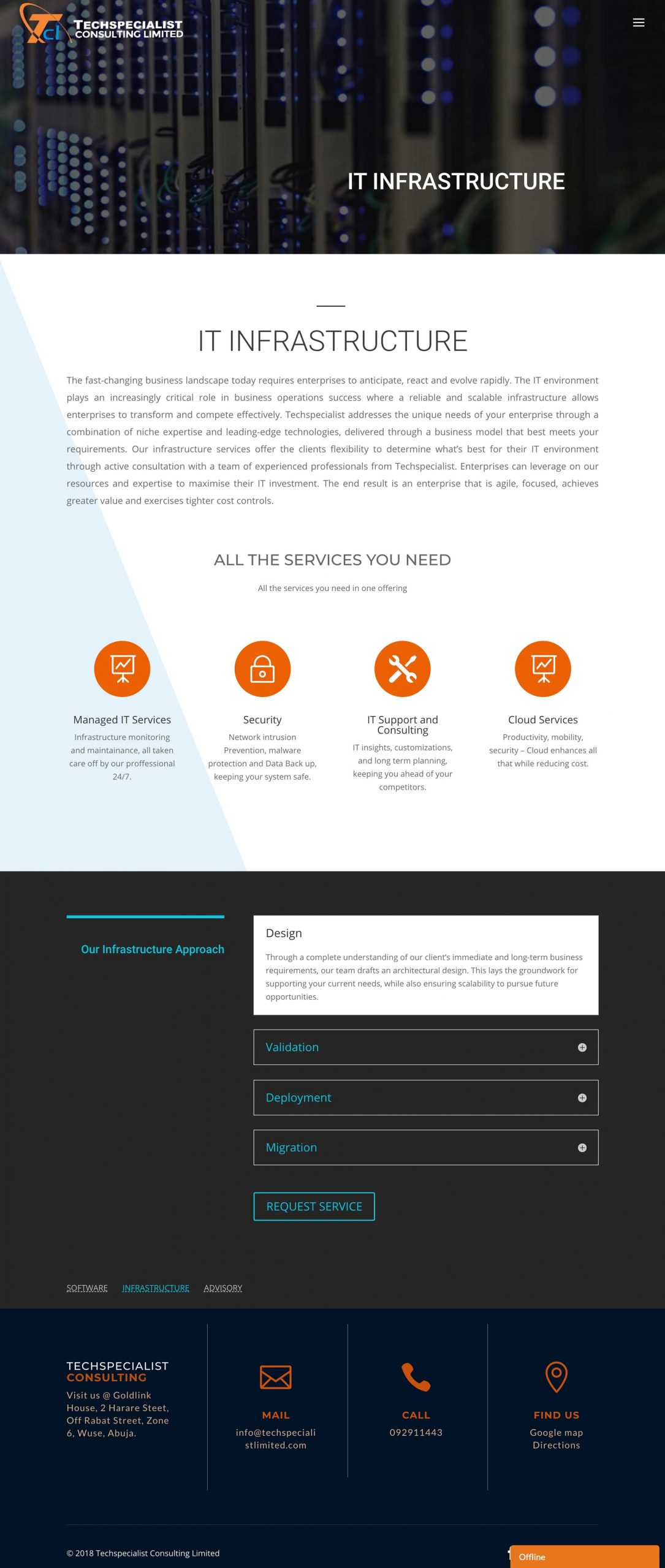
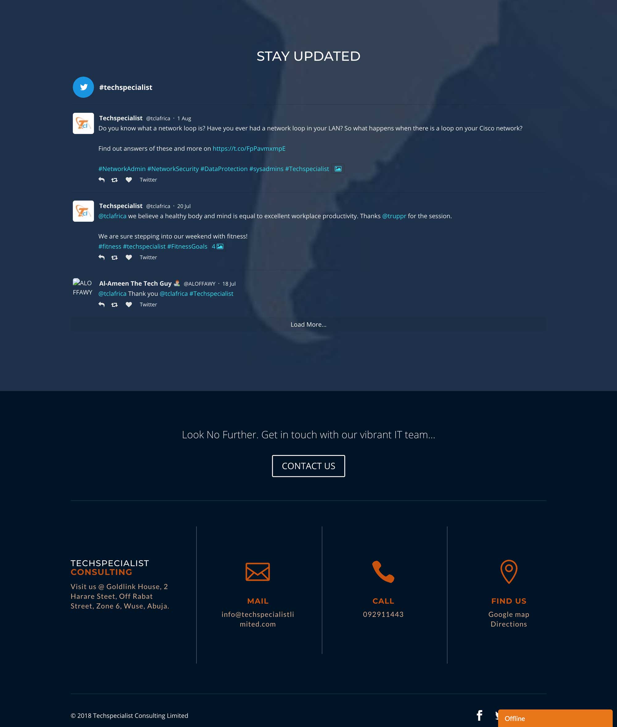
I decided to gather all information of the products and services which are in pdf files and transfer them as web pages so users need not download but can view instantly on the website. Secondly, I also introduced a chat box right at the age of the website, for user who wants to swiftly get in touch with the company. Alongside I designed a social media update view section to allow the company get instant update on users post about the company.
Outcome
The engagement of the website spike by 30% as potential clients can now communicate with the company with ease through the chat box.
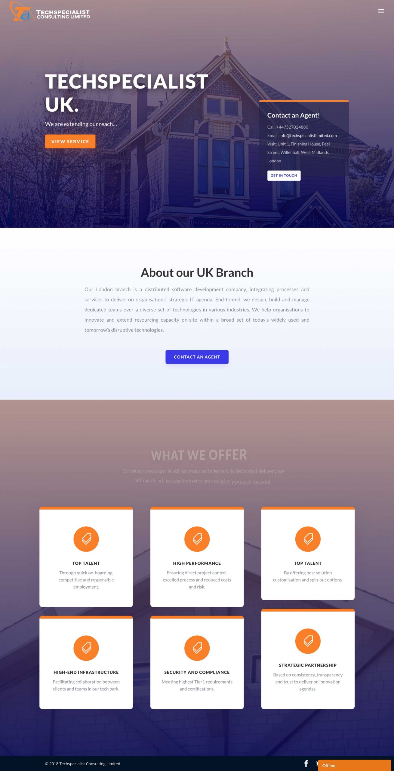
The Uk branch was placed on the menu help users understand the company is both locally and internationally recognized.
User Interface
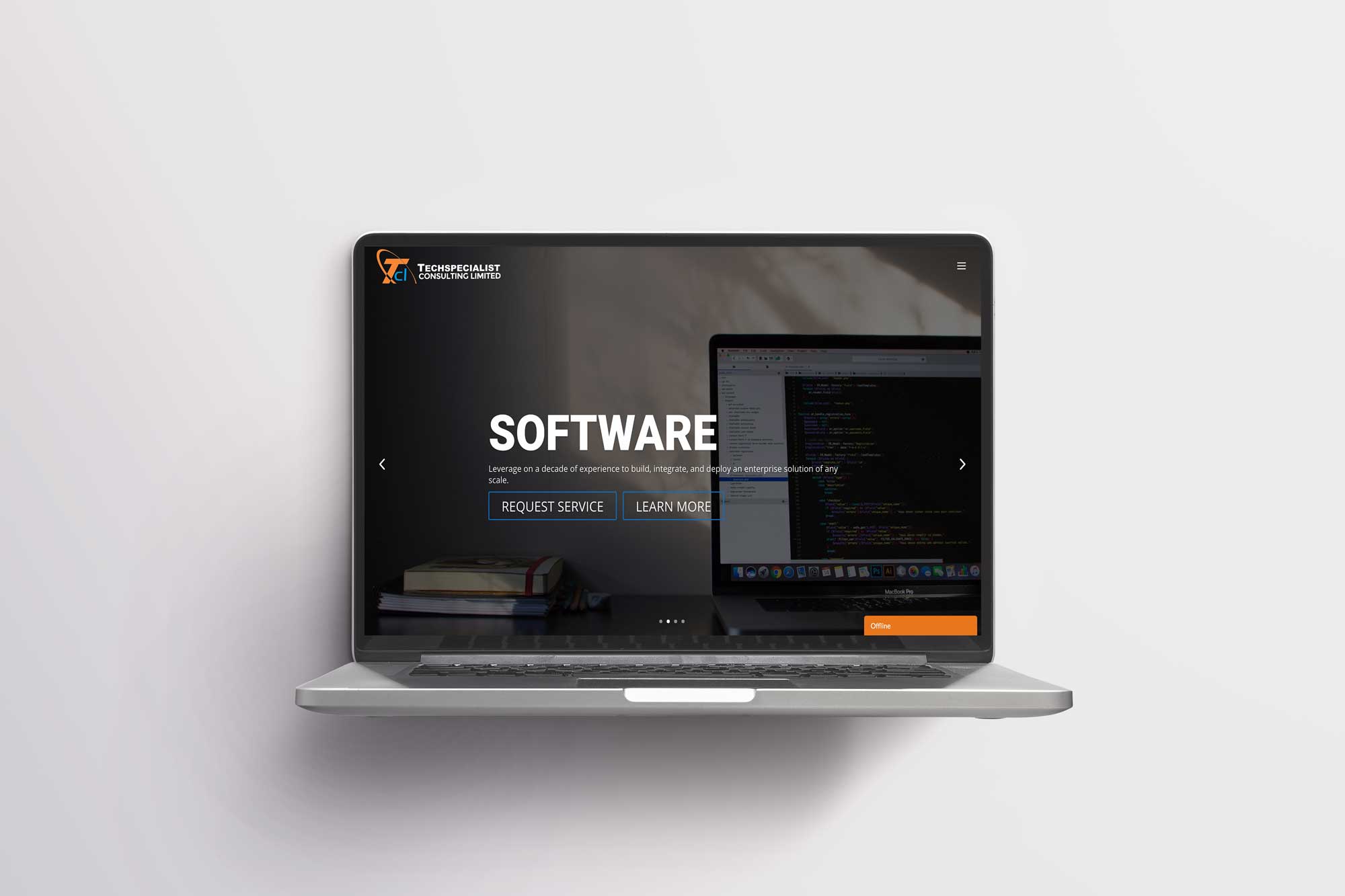
I placed the chat box at the bottom of the page so users can connect swiftly with the company.
Product descriptions clearly writing out in an accordion for ease of understanding.
Product Page
